The library has a sign for the first time
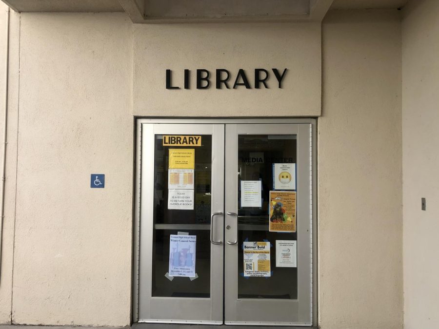
The new library sign above the doors. In the glass window is the old handmade sign by teacher librarian Susan Adamich. Photo by: Kendall Garcia
December 5, 2022
Ventura High School’s library welcomes its first official sign
On Nov. 30, the library got a brand new sign funded by the PTA. The library previously only had a small handmade sign taped to the back of the glass door made by VHS’ teacher librarian, Susan Adamich.
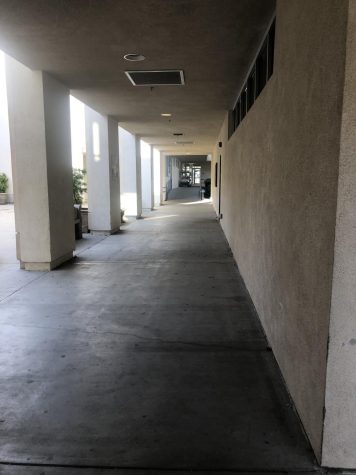
Adamich said, “[The new library sign] is beautiful. I love the lettering and the style. I don’t know [who designed it], but the PTA paid for it. They got somebody to design it and I know it has been years that we have been talking about having better signs on campus. [Before] when you would go to the office and look down here [towards the library] it just looked like a blank door. Now it says library a lot clearer [,so people can see it way better].”
Adamich made it clear that the library has never had an actual sign.

Adamich said, “I was even thinking of just painting the word library by myself onto the wall, seriously. [This] is not an easy school to navigate by [just looking].”
It has become an idea within the VHS faculty, such as the counselors and a handful of teachers on campus, to add more of these signs around campus. For example, labeling places such as the office and the cafeteria with signs in a similar style.
“A couple of the teachers say, ‘well why don’t we have these signs all over campus?’ And I think that’s in the plan [for the future] because [now that the library has a sign]. If you look down to the office, it just looks like a blank door. The only thing the office has [for identification are] the small letters that read office on the glass door. You can barely read [the sign] because it’s see-through. [I am] hopeful of them getting signs like this all over campus. I would love it. And I’m sure visitors would appreciate it to help guide them around campus,” said Adamich.
Bailey Steen ‘25 said, “The library sign looks nice. It looks very sleek.”
Adamich said, “I think they did a good job with the sign. Let’s hope that nobody tries to vandalize it because [I really like it].”


![Lindsay Guzik, new assistant principal said, "I am settling in [at VHS] pretty well. I know a lot of the students, so that makes it a little bit easier coming from Cabrillo, and it's been nice to see them all grown up." Photo by: Abraham Kassa](https://thecougarpress.org/wp-content/uploads/2025/09/IMG_9728-300x200.jpg)

Cherie Egbert • Dec 9, 2022 at 11:44 am
Hi There, it’s so great to see an article on this! I wanted to clear up the mystery on the sign design. It was Cherie Egbert your past PTSA President who spearheaded the sign project and its design and PTSA sponsored it. Inspiration was taken from the letters on Catalina Street and then she worked with Dave’s Signs to get the projection heights, and spacing just right. This is a Legacy project and is meant to create a friendly, inviting environment in front of the library and it also gives an orientation which builds psychological safety. It is Cherie’s PTSA’s hope that this project will inspire more signage for the students and staff at VHS. Hats off to your administration for supporting and approving the project too.